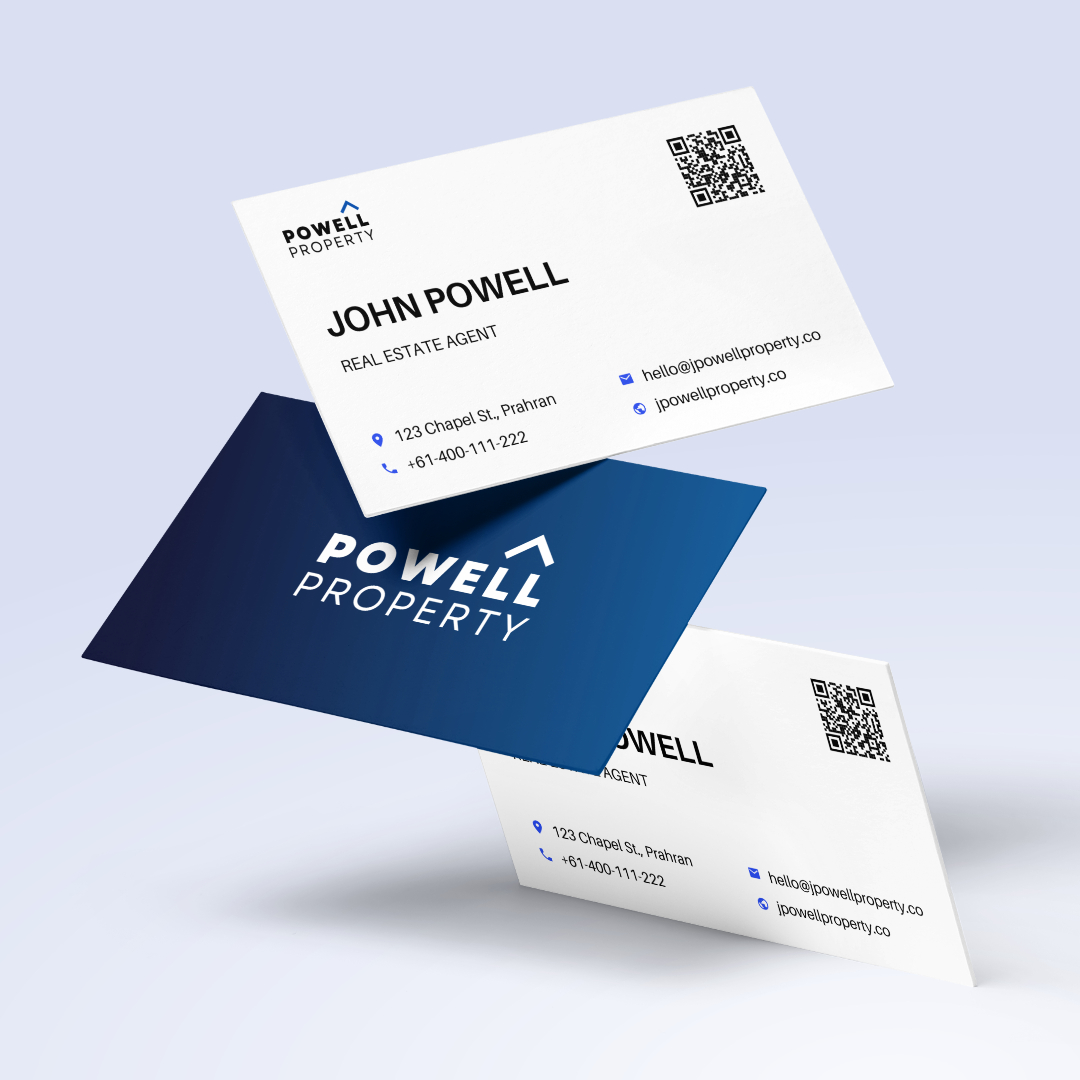
QR codes are a convenient way to connect places & things to the digital world. They’re simple and easy to use: you simply scan a code with your phone camera and are instantly taken to anywhere on the web.
These useful little square codes are great for marketing your brand, because they can connect both new and existing customers to your online content, and make for better customer experiences.
While the basic use of QR codes is straightforward: you simply paste a link into a QR code generator, and print the code it creates, there are some key points to keep in mind when using QR codes.
In this post we’re exploring the key factors that will make your QR codes a success, and how to avoid a QR ‘fiascode’.
The key to a good QR code: be strategic
QR codes make a big first impression. A user who scans one might be interacting with your brand for the first time. A bad experience could make them unlikely to come back.
Like most marketing activities, it pays to have a plan and be strategic with your QR codes.
It’s easy to create a QR code that just links to your homepage, or to a product page, but that’s definitely not the best experience for your customers.
The big thing here is:

Provide value to the customer
Customers are engaging with your QR code because they want more information, or because they want to take an action on their customer journey with you.
It’s important to give the customer a valuable, worthwhile experience, which could include:
- Giving them the information they want
- Letting them take actions they want to take (like subscribing to your email list, following you on social, or buying more product)
- Providing interesting and helpful information (like your brand mission and product tips)
- Providing offers, discounts and rewards (like sales, coupon codes and loyalty points)
Consider the context
QR codes should connect between the real and digital world in a way that makes sense. That means considering
- what the code is on
- when people might scan it
- why they are scanning
- what device they are scanning on
- what they are doing when they scan (they might be shopping, unboxing your product at home, reading a magazine or walking on the street)
For example, let’s imagine a code is placed on a restaurant sign in a busy shopping area, the context is:
- the sign is in a busy shopping street
- people who are unfamiliar with the restaurant scan the code
- they scan because they want to know more about the food and atmosphere inside
- they are on their phone
In this scenario, it doesn’t make sense to create a QR code that links to a wordy ‘about us’ page. Instead, the code should be focused on visual, ‘easy to digest’ (no pun intended) content.

Consider your goals
Think about your business goals and how the QR code can help you reach those objectives. Your primary goal might be to:
- Increase awareness of your products and services
- Show more information about your products and services
- Tell your brand story
- Increase repeat sales
- Get email subscribes
- Get social follows
- Increase social sharing and user-generated content
- Get more reviews
Create your QR code plan around these objectives and your codes will be more useful to users, and help you reach your business goals faster.
Create a brand experience
Every interaction with customers is an opportunity to tell them more about you, your story, products & services. It’s important to think about how a QR code experience fits into your overall brand experience. Make sure that:
- The QR code design matches your brand
- The content format and tone matches your brand
- The content is valuable to the customer
- Customers can keep interacting with your brand – through email subscribes, social follows and more.
Tips for making effective QR codes

Provide a clear call to action
A QR code on its own is a mystery box… It could lead anywhere! If they have no idea what they might get, customers are less likely to scan.
That’s why it’s important to add a label, or ‘call to action’ to each code, so the person scanning knows what to expect.
A QR code call to action should be short, simple, clear and, enticing.
Example QR code calls to action:
Scan for helpful tips Scan to learn more Scan to see inside How-to guide – Scan me Scan for a video message I’m a video code – scan me
Check out our post on how to create a great call to action, and our downloadable template of QR code CTA graphics.
Make the code stand out
Each QR code should draw the viewer’s attention to it, and encourage them to scan.
Experiment with different ways to highlight the code in your design. Here are ways to make QR codes stand out:
- Visually separate the code from other content
- Use contrasting colours to frame the code
- Add arrows, lines or a box around the code to draw the eye
- Add eye-catching typography
- Use illustration and graphics near the code to draw the viewer’s attention
Keep links short
QR codes have an interesting quirk, which is that you can keep adding data to them and they just get bigger, and bigger and bigger.
This is a problem – an inexperienced QR-code creator can inadvertently create a gigantic QR code that must be printed at a much larger size to be scannable.
When creating QR codes, try to keep the length of the link as short as possible. The shorter the link, the smaller the resulting QR code, so it will look less crazy, and the smaller the printed code can be.
Tips for placing QR codes
As important as the design of the QR code is, if the code isn’t placed well it won’t be scanned! Place QR codes where they are:
- Evenly lit, with enough light for phone cameras
- In a prominent location
- Easy for customers to reach
- Relevant to the location
Tips for QR code content
Just as important as the code is the landing page the code leads to! QR codes are an opportunity to provide value and promote your brand, but without good content, they can leave customers disappointed.
Here are some key points to consider when creating QR code content:

Make the landing page mobile-friendly
The majority of QR code scans happen on a mobile phone, so it seems obvious that the content of a QR code landing page must be created for mobile phones! Sadly, this is often not the case.
A mobile-friendly page:
- Fits different screen sizes
- Designed for a vertical aspect ratio
- Loads quickly
- Easy to navigate
- Touchscreen friendly
- Thumb friendly
Create mobile-friendly content
Users on their phones are used to social media and optimised websites, so they expect short-form, easy to consume content.
Large passages of text, complex graphics and hard to navigate menus are unappealing for mobile users.
Video is the best option here as it doesn’t require much navigation, is easy to watch on the go and seamlessly works across multiple screen sizes.

Keep the content relevant and updated
The only thing worse than an outdated or broken web page is an outdated or broken QR code!
For the best user experience you should regularly check your QR codes to make sure the content is working and remains relevant.
You can avoid broken links by not changing your website structure without redirecting your QR codes, and never linking directly to services like YouTube. These sites can change their links or block your content without notice making your QR code useless.
A good way to avoid broken QR codes is to use a dynamic QR code generator. These services create a QR code with a dynamic link that you can redirect anywhere, as needed.
The secret to great QR content? Qub video codes

If you’re trying to make QR codes work harder for your small business, try Qub – it’s a new format of video QR code that you can create, update and manage just using your phone.
Qub video QR codes are an engaging, mobile-friendly format, with interactive links and apps right on the video page. Qub is designed for brands that want to tell their story and create great customer experiences using QR codes. Best of all, Qub video codes are ad-free, updatable at any time and the app is free.


